
Getting the much-needed attention that will increase your readership and also generate continuous streams of income should begin with the creation of a great eBook cover. This is the component that your readers will see first and determine whether to click on your book or not. Publishers are beginning to realize the importance of eBook covers of great standards, you can’t just create any eBook cover and expect readers to overlook it. If you are ready to create more impressions, simply learn about the following tips on eBook cover creation.
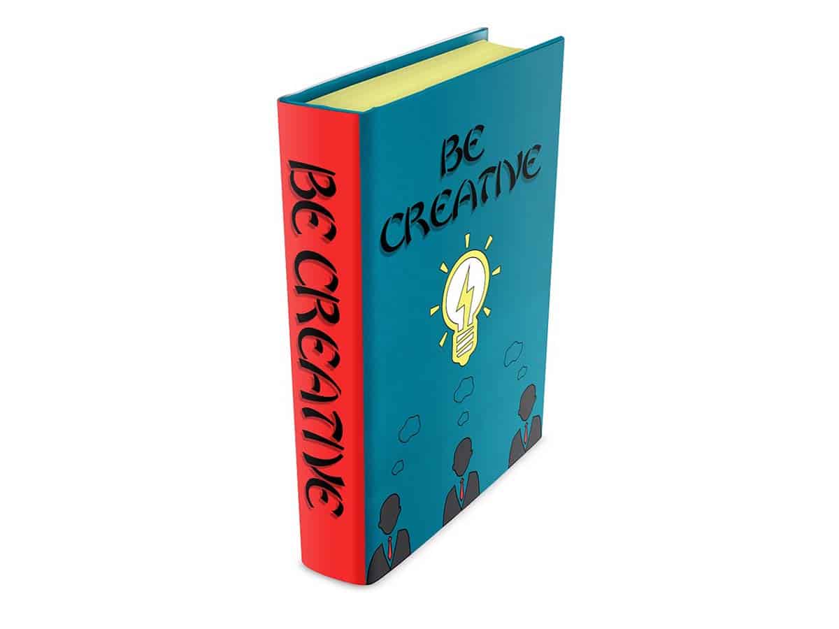
1. A Descriptive Image Is Important
A good Book Cover Mockup starts with the option of an image. You may add great colors and make your cover page appear sunning but without a descriptive image, it may still not make a lasting impression. High-resolution images optimized with the right size are important but a descriptive image will give you some extra advantage when it comes to selling your eBook. It gives the readers a sense of what to expect when reading the book. You can use hand drawings or silhouettes to create the best descriptive images for your book cover.
2. There Are 3 Elements Of A Book Cover
There are three elements of a book cover you should know, these are; Background, Image, and type. You must pay attention to these 3 elements when designing your book cover. The background also includes texture. Plain color backgrounds can be dull but a contrasting graduated color is fun. Make use of a strong image of you want your book cover design lifted. It should convey the style and subject of the books. High-quality images with recommended Pixel resolutions are encouraged. You can purchase water-marked images for his purpose. The type or typography is another element that must be suitable for the book’s genre and must be smooth and readable.
3. There Are 3 Shapes And Sizes You Should Consider Based On The Platform
You need to find the ideal shape for your book cover based on the platform your readers are accessing. For instance, the ratio for a rectangular book cover on devices like Kindle screen is 3:2. This means the ratio of length to width should be 3:2.
For iPad screens, digital photos, and some videos, a ratio of 4:3 is recommended for book covers. On the other hand, HD videos, smartphones, and able screens will require a ratio of 16:9. He Square 1:1 ratio is not a screen ratio, this ratio has become one of the most popular product images on websites. This ratio is popular because it accommodates both horizontal and vertical designs to maximize ad space.
4. Complementary Colors Are The Best
For some simplicity purposes, you can use 3 complimentary colors on your book cover. Fewer complementary cover colors will maximize the contrast. To achieve the best colors for contrast, choose between blue, orange, white, and black. Spread the contrast between the text and background for better results.
5. Check The Covers In Your Genre
Perhaps, this should be the first step you need to take before creating your cover art. You should check these covers in your genre and you will notice that most books in your genre are characterized by similar themes. You will notice that every genre has a pattern, if the text fonts are indifferent, the images are set up differently. Though you want to stand out from the crowd, you still have to follow the pattern of your genre so that your readers will know what to expect.
6. The Text On Your Book Cover Must Be Easy To Read
EBooks are different from physical books, hence the lesser the texts, the better. You should consider the author’s names, accolades, and Book title only, on your cover. The fonts of your typography should be user-friendly. Try as much as possible to reserve the top book half for the title only except you want to add some famous authors. Bolden the typeface on display, experts suggest that San Serifs could be your best option because they could be the easiest one to read. It is also important that you make the letters, especially those of titles very big.
7. Give Book Cover Elements More Spaces To Breathe
By default, the book cover has a small canvas but you want to ensure there are lots of spaces on the cover for every element. You can make use of white space because it can make your typography much more readable. One great efficient pattern for any eBook design is to allow some space after the title at the top, then add your descriptive image in the middle then put some space before putting the name of the author at the bottom.
8. Always Stick To Standard Dimensions
Owners of publishing platforms know the importance of following standard rules as regards image resolutions and dimensions, hence this should be your first consideration when designing your book cover. Pay attention type, image dimensions, and requirements for resolutions on the platform you are publishing on. A portrait layout is usually one of the requirements for creating eBook covers, you should therefore pay attention to the edges of the cover and leave some space for possible errors. Do not try to ignore the requirements while designing your book art.
Conclusion
They say practice makes perfect, this is also true when it comes to creating the perfect eBook cover that will stand you out from the crowd, boost your readership numbers, and help you generate sales. You may have to try several book covers designs before you arrive at your final cover hat will serve as the basis for all other future book covers you will create. Being consistent with a great book cover is one sure way to boost your brand and sustain your readership over a long period. The things explained in this piece of content are essential basic things you should keep in mind as regards designing a book cover. There are also free practice templates offered by top online publishing platforms to help you sharpen your book cover design skills.


